Here is a viral campaign they did recently. The idea is great but the production is even better, everything flows so smoothly and the product as a background item whilst the 'fingerskater' get's all the attention is something many fashion companies would not be game to do, and so wonderful.
Showing posts with label Advertising. Show all posts
Showing posts with label Advertising. Show all posts
Saturday, November 13, 2010
Fingerskate
Hermes, pure marketing genius. Everything they do is brilliant, from their branding (packaging, business cards etc.) to their store design and windows, and of course, their advertising.
Here is a viral campaign they did recently. The idea is great but the production is even better, everything flows so smoothly and the product as a background item whilst the 'fingerskater' get's all the attention is something many fashion companies would not be game to do, and so wonderful.
Here is a viral campaign they did recently. The idea is great but the production is even better, everything flows so smoothly and the product as a background item whilst the 'fingerskater' get's all the attention is something many fashion companies would not be game to do, and so wonderful.

Thursday, September 30, 2010
Nice Jugs.
Some lovely bottle design and packaging.
Bottle design for Hwila mineral water of Sweden by Neumeister. Neumeister have tonnes of lovely work on their site. I think these bottles really reflect their contents, they look clean and refreshing.

Concept design for Forgeron Beer Designed by Dmitri Kuznetsov and visualized by Pavel Gubin and Naming by Ilya Milovanov for the Trudot community. The bottle top resembles the froth on top of a jug, a nice touch.

Knuthenlund is a Danish company that produce organic farmed products such as cheese and milk and have recently developed organic milk, the bottle design is reminiscent of old style glass bottles but with a beautifully delicate print on the front. I think it suits the brand perfectly.

Concept design for organic honey by Marcel Buerkle. I love how it strays away from taditional honey packaging shapes and avoids use of the obvious color - yellow and goes for a very subtle gold on white. It's so beautiful it looks like a skin/hair care product.


Crystal Head Vodka is a company founded by actor Dan Aykroyd and artist John Alexander. The name and bottle shape is based on the 13 Crystal skulls which have been found all around the world and all the myths and theories behind where they originate from and their alleged powers. A very cool concept. I especially like the wooden lid on the bottle.
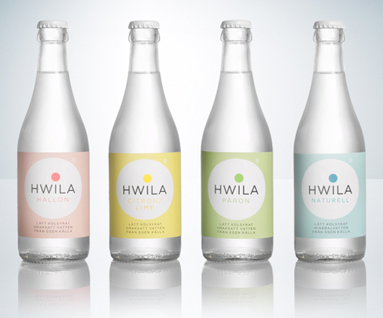
Bottle design for Hwila mineral water of Sweden by Neumeister. Neumeister have tonnes of lovely work on their site. I think these bottles really reflect their contents, they look clean and refreshing.
Concept design for Forgeron Beer Designed by Dmitri Kuznetsov and visualized by Pavel Gubin and Naming by Ilya Milovanov for the Trudot community. The bottle top resembles the froth on top of a jug, a nice touch.

Knuthenlund is a Danish company that produce organic farmed products such as cheese and milk and have recently developed organic milk, the bottle design is reminiscent of old style glass bottles but with a beautifully delicate print on the front. I think it suits the brand perfectly.
Concept design for organic honey by Marcel Buerkle. I love how it strays away from taditional honey packaging shapes and avoids use of the obvious color - yellow and goes for a very subtle gold on white. It's so beautiful it looks like a skin/hair care product.
Crystal Head Vodka is a company founded by actor Dan Aykroyd and artist John Alexander. The name and bottle shape is based on the 13 Crystal skulls which have been found all around the world and all the myths and theories behind where they originate from and their alleged powers. A very cool concept. I especially like the wooden lid on the bottle.
Wednesday, September 29, 2010
Smoking is Cool.
The new packaging design for Vogue cigarettes is lovely.
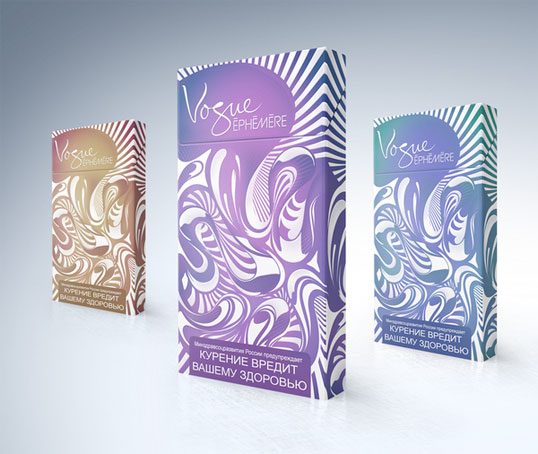
Obviously inspired by swirling cigarette smoke, the new packaging, designed by Slava Fedutik, is modern and colourful and really uses the packaging the way it should be used. Because it is illegal to advertise cigarettes and stores are not allowed to display them it seems that cigarette companies need to work harder at making their packet visible when in use and making it something that is desirable to carry, a fashion accessory of sorts. Vogue has always used fashion in their branding, from the minimalist all white coloring of the cigarettes to their long narrow shape and slim packet.

The packaging and design of the cigarettes makes you feel as though you will be oh so chic and sexy when smoking them, like the image below.
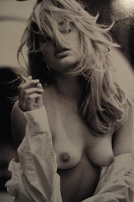
In reality you probably won't unless you're a gorgeous, slim, French woman. You'll probably just end up with mouth cancer, which is not such a sexy look. But who wants to dwell on that?
There is a blog devoted to images of people looking ridiculously cool whilst smoking, Le Smoking. Beautiful photos.
Obviously inspired by swirling cigarette smoke, the new packaging, designed by Slava Fedutik, is modern and colourful and really uses the packaging the way it should be used. Because it is illegal to advertise cigarettes and stores are not allowed to display them it seems that cigarette companies need to work harder at making their packet visible when in use and making it something that is desirable to carry, a fashion accessory of sorts. Vogue has always used fashion in their branding, from the minimalist all white coloring of the cigarettes to their long narrow shape and slim packet.
The packaging and design of the cigarettes makes you feel as though you will be oh so chic and sexy when smoking them, like the image below.
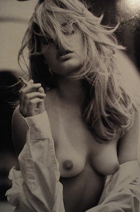
In reality you probably won't unless you're a gorgeous, slim, French woman. You'll probably just end up with mouth cancer, which is not such a sexy look. But who wants to dwell on that?
There is a blog devoted to images of people looking ridiculously cool whilst smoking, Le Smoking. Beautiful photos.
Saturday, August 28, 2010
All the Cool Kids.
Firstly, my opinion of children is hardly a positive one. I think they are unpredictable, messy and not particularly cute. That said, these kids are pretty darn cool. The following children's collections are wonderful and the styling and casting of their shoots is absolutely perfect.
The kids appear effortlessly cool and stylish without being trite. This is what all the children of the world should be wearing. Just say no to Dora the Explorer and Ben 10 merchandise.
I have said many a time that Marc Jacobs does advertising better than fashion and I'm sticking to my guns. The Little Marc Jacobs collections are lovely, the spring 2010 one especially so, but more lovely are the catalogs that accompany them. The children are who you want your children to be, they are gorgeous. And the photos are fun. Marc Jacobs has found the perfect medium between high fashion and kids still being kids, no contrived poses. The images all look spur of the moment and totally brilliant.


Talc is a french children's label. Their clothes are simple and stunning. They are all great for kids to run around in and still perfectly stylish. Never have I so badly wanted to fit into children's clothing. Like the Little Marc Jacobs catalog, Talc's is also beautifully cast. The children are stunning and are so wonderful in front of the camera. All Talc's catalogs feature children wearing masks of some sort and all their images have block coloured backgrounds and a lovely soft light. The girls in the 2011 preview catalog (last 2 Talc images) seem so effortlessly hip and chic, i wonder how they have attained this coolness at such a young age. Proving that the French really are a superior race.
 (This boy is so beautifully elfish)


 (I want to be the girl in the brown floral jumpsuit)


The kids appear effortlessly cool and stylish without being trite. This is what all the children of the world should be wearing. Just say no to Dora the Explorer and Ben 10 merchandise.
I have said many a time that Marc Jacobs does advertising better than fashion and I'm sticking to my guns. The Little Marc Jacobs collections are lovely, the spring 2010 one especially so, but more lovely are the catalogs that accompany them. The children are who you want your children to be, they are gorgeous. And the photos are fun. Marc Jacobs has found the perfect medium between high fashion and kids still being kids, no contrived poses. The images all look spur of the moment and totally brilliant.


Talc is a french children's label. Their clothes are simple and stunning. They are all great for kids to run around in and still perfectly stylish. Never have I so badly wanted to fit into children's clothing. Like the Little Marc Jacobs catalog, Talc's is also beautifully cast. The children are stunning and are so wonderful in front of the camera. All Talc's catalogs feature children wearing masks of some sort and all their images have block coloured backgrounds and a lovely soft light. The girls in the 2011 preview catalog (last 2 Talc images) seem so effortlessly hip and chic, i wonder how they have attained this coolness at such a young age. Proving that the French really are a superior race.
 (This boy is so beautifully elfish)


 (I want to be the girl in the brown floral jumpsuit)

I like selected pieces from Stella McCartney's collection for GapKids but in general I'm not a huge fan. The images however, I love. The simple sets and barnyard animals are brilliant. the casting isn't quite as good as Little Marc Jacobs and Talc, some of the kids appear too 'posey' and even mannequin like whilst others are great and natural. As a sucker for glitter i can't help but love the glittered animals too.


Tuesday, July 20, 2010
RepliCan't Belive it Furniture.
I am finding it hard to fathom that every time I open a home wares magazine I am bombarded by ads for 'replica' furniture companies. That is, companies blatantly copying designer furniture and selling it as much lower prices. They even name the designer that are plagiarising. Firstly, I'm not sure how they are allowed to do this, maybe because they are being honest about the fact that it's fake and referencing the designer? I'm not sure.


Either way, who would want to buy this furniture? We all know how tacky a fake Louis Vuttion handbag is so why is fake furniture OK?
Personally I'd rather sit on an original Ikea than a fake Eames.
Sunday, July 18, 2010
Nostalgia in Advertising.
New Zealand white goods company Bond + Bond have had clever ad agency DraftFCB come up with their latest promotion. They have taken the approach of using nostalgia to make modern white goods, which are often viewed as cold, hi-tech and impersonal, a little more emotional.
They used a white metal billboard to simulate a fridge then created huge plastic magnetic letters with which to spell out their latest deals.
Fun, no?

They used a white metal billboard to simulate a fridge then created huge plastic magnetic letters with which to spell out their latest deals.
Fun, no?
Friday, June 25, 2010
A Question..
.. Why are Marc Jacobs ads so much better than their clothes?


Answer: Cause Juergen Teller shoots them.
And there's even a book!
Unfortunately it is sold out.
But you can buy it on Amazon.com.
Unfortunately it's about US$279.00.
Subscribe to:
Posts (Atom)